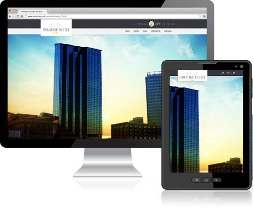
Desktop, Tablet, and Mobile Web
People coming to your website and using your web applications are using different devices that are different sizes and have different capabilities. Whether a desktop, mobile phone, iPad, 7" tablet, Kindle, netbook, laptop… it's a long list and it's going to keep getting longer. You need to build your website and web applications to anticipate and respond to what your user needs, when your user needs it, regardless of what device they are using.